Welcome to Jasper School of Data

We provide structured training in Microsoft Excel + PowerBI for business intelligence. Our focus is on helping learners understand data, build practical dashboards, and communicate insights clearly.

Programme Overview

Our main programme is Excel + PowerBI for Business Intelligence.
It introduces Excel + PowerBI Desktop, teaches how to prepare and transform data, and shows how to design clean reports. The emphasis is on practical tasks, so learners leave with skills they can use immediately.

Requirements

To take part, learners need:

Learning Outcome

Upon completion of the programme, learners will be equipped with practical, hands-on skills in Microsoft Excel + PowerBI. The key learning outcomes will empower them to transform raw data into insightful dashboards, communicate business intelligence effectively, and design professional reports that support data-driven decision-making

Curriculum

Our curriculum is designed to guide learners step by step, from foundational skills to advanced dashboard creation. Each module focuses on practical application, ensuring that students build real-world competencies in data preparation, visualization, and reporting using Microsoft Excel + PowerBI

Excel + PowerBI Desktop Fundamentals

Learners will start with the basics of Excel + PowerBI Desktop, exploring the interface, data model, and report view. They’ll gain a strong foundation to begin creating their own reports and dashboards.

Data Preparation and Transformation

Students will learn how to clean, shape, and prepare data for analysis, including working with numerical, text, and date columns. They will use Excel + PowerBI built-in tools to prepare raw data for clear and effective reporting.

Rolling Calendar and Time Intelligence

This module teaches how to build a dynamic date table for time-based analysis, enabling students to create rolling reports and perform comparisons over time, such as year-over-year growth.

Visual Design and Best Practices

Students will explore how to design clean, effective, and visually engaging reports and dashboards. This section covers the best practices for choosing the right charts, visuals, and KPIs to tell a story with data.

Interactive Dashboards

Learners will apply their knowledge to create interactive dashboards that allow users to drill down into data, filter results, and explore business metrics dynamically. The focus is on user experience and decision-making.

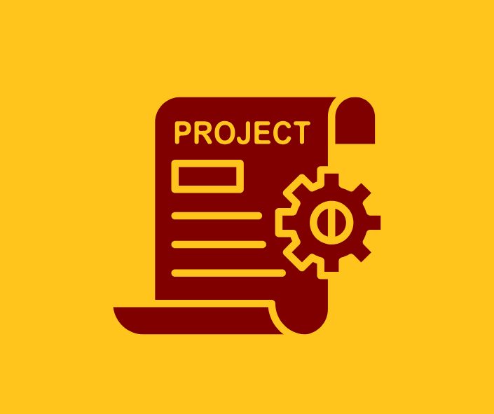
Portfolio Project and Review

In this final module, students will build a comprehensive project, such as a sales monitoring dashboard, that demonstrates their ability to apply what they've learned. They will receive feedback and prepare the project for inclusion in their portfolio.

Certificate

Graduates receive a Jasper School of Data Certificate in Excel + PowerBI
This digital certificate is suitable for CVs and professional profiles and demonstrates the ability to prepare data, design dashboards, and communicate findings.

Who It Is For

© 2025 Jasper School of Data. All rights reserved.